Atlantic Property Logo Design
Atlantic Property Logo Design
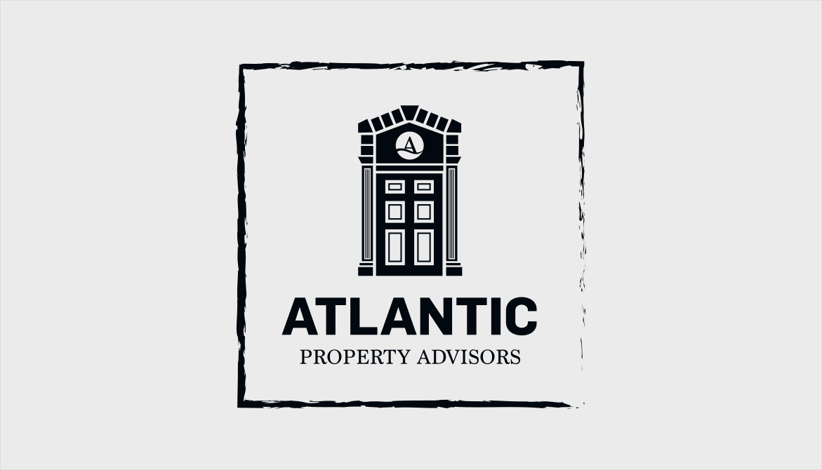
Atlantic Property Advisors is an up-and-coming Real Estate firm in the Boston Metro area. They have recently formed a partnership with Keller Williams (KW), one of the largest real estate companies in the world.
CONTENT PLANNING
Problem:
Atlantic Property Advisors needed a logo that represented Boston, the Atlantic coast and the new high-rises that were popping up in the Boston Metro area. Their main concern was making sure the logo looked good with the established Keller Williams colours, but allowed Atlantic Property Advisors to have its own identity and stand alone branding. They didn’t just want their logo to be eye-catching, they also needed it to be accessible and attractive to new homeowners.
Solution:
As we worked through the design process, we decided that designing just for the high-rises was too limiting. Many of their clients would still be buying houses, rather than condos, and they needed to incorporate this into their logo too We came up with a concept for an ornate and iconic Boston doorway. The team at Atlantic Property Advisors loved the teal colour from the Mood Boards. You can see at the bottom of the page that we were able to incorporate that colour into the final logo. With a couple of revisions we were able to incorporate all the elements the new logo needed to encompass, and we were both excited about the final product.
STYLE ANALYSIS
![]()
MOOD BOARDS

VERSION 1

VERSION 2
FINAL LOGO VARIATIONS
![]()
PROJECT COMPLETED: AUGUST 2016
Get in Touch
A great logo means more than just being recognizable in your industry. Find out more about my logo design services here.


